Seeing Sound: Why good design matters
November 14, 2025
Article as seen in Nov/Dec issue Production360.MEDIA
(Counter?) Intuitive Visualisation:
Human instinct is a powerful thing – powerful enough that sometimes it can even overrule intellect. Even when we know something to be true, our brains are wired to respond first to what feels true. That’s why, in data visualisation, design choices can have a profound – and misleading – psychological impact: from colour choice to graph size, from the order of information to the truncation of an axis, we can read the data labels attached to graphics and understand them, and our overall impression is swayed just by the way the data has been visualised.
These effects aren’t necessarily malicious – sometimes they’re just artefacts of how human perception works – but they highlight how easily intuition can override reason, and how important it is to design interfaces that present truth, not persuasion. For Bridge, this is central to our philosophy of measurement and visualisation: to translate complex network realities into representations that inform, not influence.
Always getting better
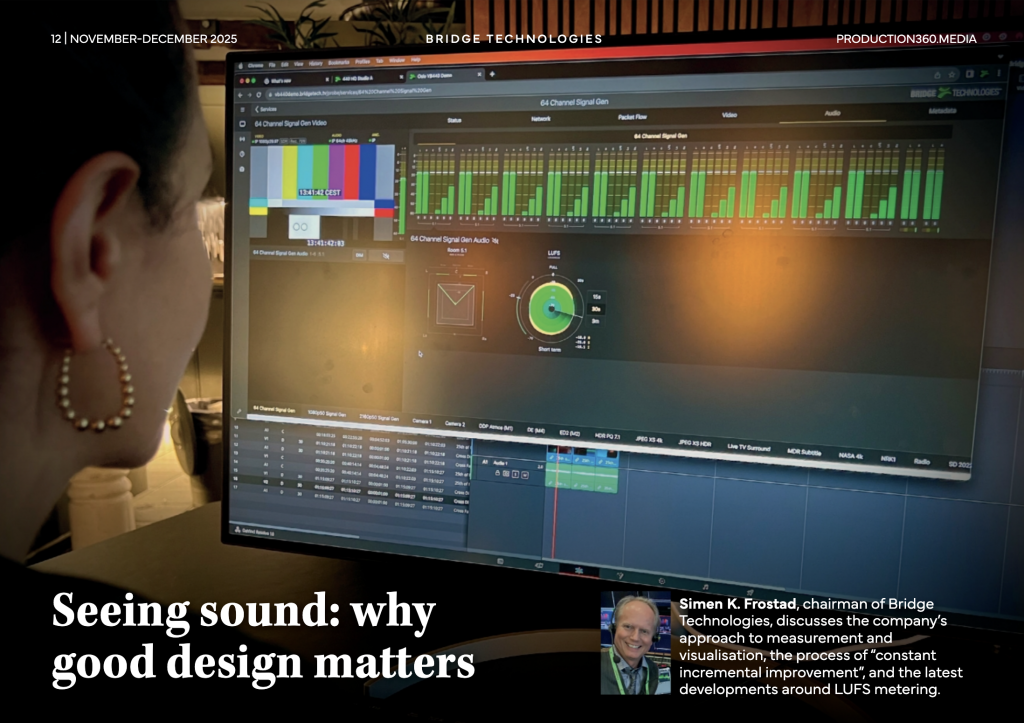
That task is one of constant incremental improvement. When Bridge Technologies set about creating the VB440 – a single, comprehensive production tool which incorporates an unparalleled number of audio, video and network visualisations to inform every part of the production process, we took nothing for granted. The aim was to provide production specialists (from anywhere in the world, through any HTML-5 browser) with best-in-class waveform monitors, vectorscopes, LUFS, Gonio and Room metres, HDR on SDR screen previews, audio downmixes and channel isolation, signal generation and AV sync capabilities, along with graphs and flows to show all aspects of network performance, packet flow and timing behaviour.
But the concept of best-in-class isn’t a static one – it’s evolutionary. Take the VB440’s LUFS meter, for instance. Its initial format was easy to use and an effective way of communicating a key aspect of audio production. But that didn’t mean there wasn’t room for improvement: particularly in how visualisations shape the intuitive understanding of data.
LUFS refinements
One particularly elegant example of this principle in action comes from a recent refinement to the VB440’s loudness visualisation – the LUFS meter. Traditionally, loudness has been represented in a circular, radar-like pattern (sometimes referred to as a polar loudness graph), where users can zoom in or out to view finer or broader variations in the signal. On earlier versions of the VB440, adjusting this granularity changed the apparent size of the ‘loudness bloom’, which could give the misleading visual impression that the sound itself was louder or softer. Of course, experienced engineers know that isn’t the case – but instinct often overrides intellect, and our eyes can influence our interpretation faster than our analytical mind can correct it.
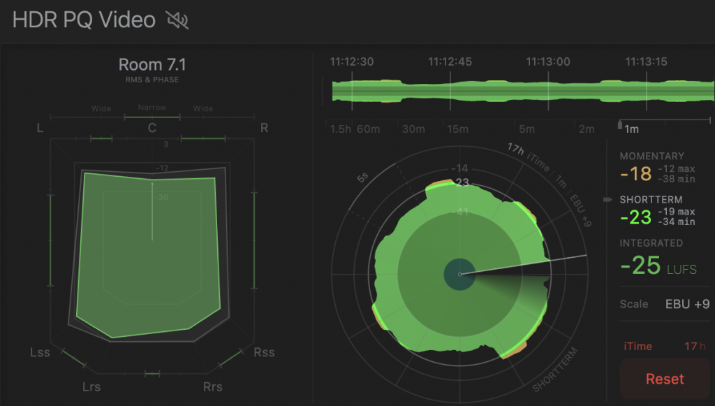
The latest version of the VB440 resolves this by decoupling scale adjustment from the visual footprint of the graph. The shape remains constant, even as the level of detail changes, ensuring that what users see always corresponds precisely to what the data means.
A similar refinement has been made to the LUFS meter’s time-based loudness display – the running line graph that tracks loudness variation over time. Previously, adjusting the measurement window effectively reset the graph, erasing historical data each time the scale was changed. The same would occur if a user navigated away from the LUFS view and returned later. While this didn’t affect the underlying measurements, it interrupted the continuity of visual context – that intuitive sense of how loudness had been evolving over time. Now, that entire context is preserved – from 10 seconds to 30 minutes – regardless of how the user navigates.
One part of many
It’s a small change in principle, but it required some clever front-end engineering, as well as a design ideology which puts the user’s ‘cognitive rhythm’ front and centre, enabling them to think and work in the natural flow of time, rather than in isolated snapshots. (Though that snapshot need is also accommodated by the ability to reset the period over which minimum and maximum values are recorded).
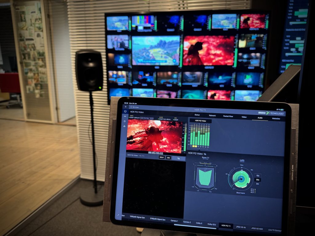
The net result is an exceptionally usable LUFS meter that gives intuitive, at-a-glance insight: visualisation that aids rather than undermines understanding. And this updated LUFS meter constitutes just one tiny element of the VB440. In the field of audio alone, the new LUFS meter sits alongside support for a virtually unlimited audio flows with up to 64 channels each, across formats from mono and stereo to immersive 7.1.4 and Dolby Atmos®. Users can access and control signals remotely through a browser interface, solo individual channels, downmix to stereo for headphone monitoring, and visualise loudness, phase coherence, and room balance in real time. Not to mention support for RAVENNA, Dante, full SMPTE 2110-31 and -41 compliance, and sADM metadata for next generation audio workflows.
But just like the LUFS meter, each aspect of the VB440’s audio performance receives the same level of minute attention when it comes to usability design. Because in broadcast technology, good design is just about what you can do, but how effectively you can do it.